MLB 2K10 Demo Impressions

From the time the demo for MLB 2K10 was released I’ve been keeping notes, some of which I’ve been posting to Twitter along the way. I’ve compiled my thoughts and observations here and will just stream them out. I’ve also included another two HD videos of a demo play through.
Overall based on the demo MLB 2K10 is going to offer a much cleaner and more rewarding experience than previous iterations. There are a number of issues though, some of which won’t be properly evaluated until the complete game is out, that appear to hold it back from being better than just a decent offering. Continue on for my full impressions as well as another set of videos of a demo play through.
First in terms of demo structure it’s a shame that it lacks commentary and doesn’t offer the opportunity to change difficulty level or camera angles. On the plus side though I dig that the starting pitchers and game time are randomized.
The difficulty level is set on Pro and with no way to adjust it that is what I’ll be basing my thoughts on. Overall the game has a fun feel to it but it is incredibly easy. I’m hitting home runs at a rate of about two per every three innings. It definitely scared me that the very first power swing I attempted with the demo I crushed a home run with Chase Utley. After a Ryan Howard ground out I followed up with a Jason Werth home run. And that was when I was just trying to get used to the game. In well over 20 innings I’ve given up something in the neighborhood of six hits and still not a single run. If the $1 million challenge were to be held on these settings there would be perfect games thrown on release day.
In terms of controls I like what has been done for both pitching and hitting. I’ve never been a fan of the stick being used in MLB 2K but I’m finding them to be enjoyable for the first time. While at the plate it has a more instinctive feel, although you do usually have to determine whether to swing big or go for contact beforehand. The defensive swing I don’t anticipate coming into play naturally and I’ll probably never use it because of that. When pitching I like the ability to choose the pitch type beforehand and then just concentrate on the motion. I’m having much more success delivering properly because of this.
Facing the AI is much more rewarding both while pitching and while hitting. The CPU isn’t swinging at everything and CPU pitchers will even give up walks of which I’ve gotten a handful. I don’t mind the Batter’s Eye too much but what does bother me is how random it is. One pitch it’ll flash and another it won’t and I’ve yet to see any discernible pattern to it. I use the location aspect of it more than to identify what type of pitch is on the way as that really hasn’t offered much of an advantage. For me I tend to swing more often because I see it come up rather than just try to hit naturally.
Fielding though seems to be a weakness as the CPU basically is in control leaving the User to just make the throws. Most of the action in the infield is so fast that there is no time to react. Even on hits to the outfield the players are usually well on their way before the User has a chance to take over.
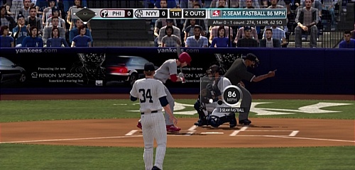
Graphically I like the overall brighter look and the stadium ambiance is more true to life. There are some jaggies and player faces particularly are disappointing. Without the commentary the atmosphere doesn’t feel up to par making the listless crowd stand out more than it probably would otherwise. Obviously the most glaring visual issue is with the jersey numbers which are far too large.
One concern I had going in was how slow the pitches seemed to be coming to the plate in the video that was out. I actually think the speed to the plate feels about right. The issue I have here is that there is little difference between an off-speed pitch and a fastball. I’ve basically been going up with the strategy of looking for location and not caring about pitch type and that has led to the success I’ve had hitting. The window is simply too large on this difficulty setting.
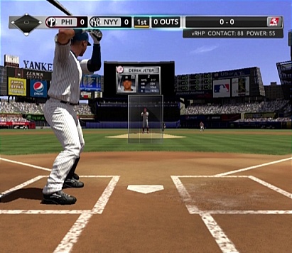
An issue with the new batting camera is that the hitters are so proportionally large that they get obscured by the scorebar and the bat even goes off the top of the screen. Initially I noticed it with Jason Werth and thought it was just because of his height. But then when I used the Yankees it had Derek Jeter positioned even worse. It is somewhat distracting and I’m surprised that a visual flaw like that would be overlooked. Otherwise the new view does provide a better opportunity to judge strikes from balls which will probably be more beneficial once the difficulty level is moved up as it doesn’t feel necessary here.

- The text above the pitch types is just too small. I have a 56″ HDTV and in sitting just about six feet away I’m having to lean in and/or squint to figure out which pitch to select.
- I’ve only hit one double which is concerning. However that double was pretty damn cool as it went over the outfielder’s head and off the wall. Otherwise hits to the outfield seem to hang in the air more often than not and the outfielders are snagging those easily.
- I had my runner get doubled-off at first base on a lazy pop-up to the second baseman. There is no way he should’ve been standing halfway to second base and not retreat until after the catch was made. Come to think of it maybe the infield fly rule should have been called.
- Ryan Howard made an impossible play catching a line drive with two hands over his head with his back turned to the plate and looking towards the right field wall. I shook my head at that. I haven’t seen any other plays along those lines made thankfully.
- I like that I’m fouling off pitches at a decent rate. This is great because it doesn’t have to do with the defensive swing and usually I get a feel for how my timing was off when it results in a foul ball.
- Framerate seems consistent which is great but with so many elements removed for the demo we’ll have to see if it stays that way.
- Player movement is awkward. Lots of starting and stopping (see example when heading to dugout after home run). Not as bad as last year though.
- Not a big deal but the pitching cursor is really unsteady and jumpy. It doesn’t move around smooth making it frustrating at times to try and get the location you want to throw for.
- Seeing occasional AI issues such as players not completing their assignments (such as the pitcher not covering first base in the video I posted last night), throwing to the wrong base, diving when not necessary, ect. That being said I’ve yet to get upset about something to the extent that I’d turn the game off because of it, which happened about once every other inning with 2K9.
What bothers me about most of the gripes I have is that they could have been fixed or adjusted based on a simple feedback session. Visual issues (small text, score overlay on top of players, over-sized jersey numbers) all could have been spotted within minutes with easy fixes being made but now the game will be stuck with them all year. Some of the other things cited in these impressions could very well be improved on a higher difficulty level but that remains to be seen. Clearly though if judging the MLB 2K10 demo primarily based on how it compares to 2K9 there is reason for optimism.
